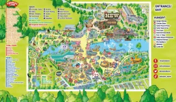
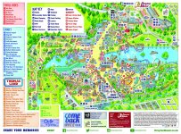
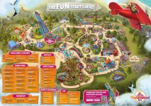
The park maps have changed considerably throughout the years, but in recent years they have taken quite the decline in how new areas and rides are added. For example in 2024 when gold rush was added, instead of finishing the area off in the art style the rest of the map is in, they took the lazy approach and just stuck the concept art over the top of it, they also did the same for vikings where they put the concept art over the triangles instead of designing it the same as the map. Sub splash didn’t even get anything besides a sticker in the corner of the map adverting it’s now open. It’s crazy how bad the editing on the waves track looks from where they have taken the stand up train off. I have attached photos below of the 2024 and the 2015 map. What is everyone’s opinions on this?


